Friday, December 6, 2013

Visit with a Professional

During Thanksgiving break I was able to present my final design project Becki Meads at Benjamin’s Carpet One. My final design project was a two floor apartment; the first floor was designed to be ADA accessible while the second floor was designed to be ADA visit able. Before I met with Meads I prepared myself by organize all my project drawings in order that worked well with the layout of the apartment. Starting with the first floor, I laid out the floor according to the likings of the couple that were going to live in this location they had mentioned that they love cooking and spending time in the kitchen and dining room. So when preparing for my met I made sure that I mentioned the kitchen first and the reasons I made my layouts main focus the kitchen. After the kitchen and dining room I discussed the living room and the studio room which were near the kitchen. Next on the plan were the bathrooms and master bedroom. Following the first floor was the shared entry and the front façade which lead me to the second floor. I went in this order while preparing my presentation to follow the floor plan and so I could avoid jumping around. Another step I took to prepare myself was to go over all my drawings with family members so I had some practices.
The practice and ways I prepared myself for my met were very helpful for when I actually began to present my project. I went in the order I had prepared, I found myself talking about the master bathroom and the kitchen the most. I spoke about the kitchen and master bathroom the most because they both had the most requirements of being ADA accessible then the rest of the apartment. I spent a lot of time on the kitchen because the couple that will reside in the space spend most their time hosting dinner parties and love cooking together, so I discussed many ways on how I designed the kitchen to be a grand space with large windows, lots of lower storage, lots of lowered counter space, aesthetically pleasing, and all ADA accessible. I also spent a lot of time on the master bathroom, I wanted the bathroom to feel large and not crowded in such a small space. In the master bathroom I added lowered shelves for storage, a roll in shower with a built in bench, lowered counter with space to roll under, and grab bars in the shower and near the toilet. In my met I was able to present all of this to Becki Meads and go into more detail on why I chose to layout everything how I did.

My presentation took place at Benjamin’s Carpet One in Richland Washington this was the first time I had ever been inside. Benjamin’s Carpet One is a large and beautiful place with many amazing choices of flooring displayed throughout the space. Becki Meads was great help and I really appreciated the time she spent with me going over my project. She gave me so much feedback on my ideas that allowed me to see how I can improve on my design. One of the most helpful feed backs she gave me was that might want to think about more storage and as I looked through my plan I realized I barely had any and that I need to keep that in mind. She also pointed out what I was doing well mostly about the way my kitchen was laid out and how she could tell it was the main focus on my first floor. I am really grateful that Becki Meads took the time to review my presentation and I really enjoyed this experience of meeting with a professional.

Thursday, December 5, 2013

Graphic Reflection


While taking ID 205 the Visual Communication course I learned a lot that will help me improve my skills for my future in the Interior Design field. This course was a great way from me to improve my sketching skills and I learned a number of different techniques that have helped me understand and accomplish many of my renderings. When I first started this course my biggest challenge was sketching, it was difficult for me to add in shade and shadows, to understand the points of perspective drawings like the horizon lines and vanishing points, and to add value to our sketches. Each week for this course we were assigned three different sketches by doing this every week my sketches had improved because the consistent practice of this trait really developed my sketching skills. I was also able to grow in my rendering skills. When we first began rendering I just believed it to be a simple use of color but value, shade, and the stroke of the color is very important. By adding rendering to our projects and our weekly assignment I discovered different methods that allowed my 2D sketches to show depth and become a better representation of the space they were portraying. All our projects during this course first started out with the use of a grid, before this course I had never used a grid to draw out any of my past perspectives. By using these grids I am now able to accurately draw a one or two point perspective of an existing or non-existing space.  The grid really helped with making sure all furniture, fixtures, windows, doors, and other items in the space were angled and portioned correctly. I believe that my biggest success in this class was being able to improve my sketching skills and I was able to do this with simple techniques. Everything I learned throughout this course will be a great benefit to my interior design future.

Sunday, October 20, 2013

Habitat for Humanity


On September 28 I was fortunate enough to go out to help build a home for a family in the Palouse area. Habitat for Humanity is a nonprofit organization that builds homes for families that are in need of help. I volunteered at Habitat for Humanity that Saturday and I am really glad that I did. I learned a lot about the outside structures of houses and about the construction site while at Habitat for Humanity. We also were able to work with one of the home owners while we were there, she is a very kind lady who has two young children and really appreciated everyone’s help


While at Habitat for Humanity we were able to help build and put up the two missing walls. To do this we had to hammer done a lot of nails! While building the walls I learned that you have to check your wood to make sure that it doesn't curve in anyway, after choosing the right wood, we had to arrange the wall by its layout, and then we nailed it all down. On the walls we added a cover which is the last layer of keeping water out, we nailed that down with greenies. When the wall was all done everyone helped lift it up to place. It is a great feeling that I was a part of building the walls for a family’s new home. I think that this experience has helped me with my interior design major because I now know a little more about the way that houses are built, their structure, and what goes into building a house.


Saturday, October 5, 2013

Sketch Crawl

During our time spent in Seattle, Washington we were able to visit Seattle City Center. In the Seattle City Center we met up with Urban Sketchers who allowed us to go out and explore the area and chose an area or subject to sketch. After sketching for an hour we all met back up and the Urban Sketchers gave us some advice and tips on sketches. It was great to see everyone else’s sketches of the area and to kind of get a glance on how they view things.  Popular sketch choices consisted of the Space Needle and EMP Museum, I decided to sketch the Chihuly Garden and Glass. This exhibition displays beautiful art work by Dale Chihuly who is a master at blowing glass; he has been able to create enormous glass sculptures. From the outside of the exhibition you are able to see some of his sculptures through the large glass windows. For this reason I decided to sketch the front side of the building where you are able to look inside the windows at his artwork. I sketched the whole surrounding area from my view and wanted to make sure I was able to add some of his work into my sketching.

Job Shadow at Olson Kundig

I had the opportunity to spend a few hours job shadowing the interior designers at Olson Kundig Architecture Firm. This firm is very well known and also very huge but in their architecture firm they have six great interior designers working with them. Each one of the interior designers I met were wonderful and they all had their own great advice, stories, and tips to share with me about my future career in design. After my job shadow I have realized that the challenges of an interior design career would be where I would like to start, within a large architecture firm, a small or larger interior design firm, or maybe even starting my own small interior design firm. The advice I was given was it would be best to start off in a small interior design firm because there are fewer people so you will have the chance to learn how to do it all. I asked them all which they preferred more residential or commercial design and why, the most common answer I received was residential design because it was more meaningful to design a home. This helped me decide that I would love to have the opportunity in my career to design residential spaces. One other great advice I was given was to network and put your work out their so others can see it. Thanks to Olson Kundig Interior Designer Team for their advice and knowledge!

Frye Art Museum

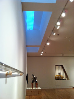
When the Frye Art Museum was being explained my favorite concept that was mentioned was that they wanted everyone to experience the building the same way and that they believe every one leaves a mark of themselves on the building in a positive way. The Frye Art Museum wanted their building to be an experience for each and every one of their visitors. When you first enter the building you go in through doors that were designed as gates, as you processed inside the entrance’s top is designed like a dome or a sphere in a half, the inside of the whole art museum uses day light to move people throughout the whole inside area. A portion of the museum is based on the golden sections. The floor in the museum is an orange color that is based off the same types of floors you would find in a butcher shop representing meat rendering. The main idea and major focus of the Frye Art Museum is daylight, day light is very critical to this building. The building is all about using daylight in many varieties of the day and to be able to navigate through the space. The Frye Art Museum shows ways that a building can be very intellectual and symbolic.

Chapel of St. Ignatius


The Chapel of St. Ignatius at Seattle University built by Steven Holl is one of the most well thought out and meaningful structures I have witnessed. In 6,000 square feet Holl manages to tell a story of “seven bottles of light wrapped in a stone box” and how each bottle of light represents an aspect of the Catholic religion. The interior of the chapel is simple but there is a reason for that, by having white walls with vertical and horizontal texture and black concrete floors the light that shines in through the windows are easily reflected off each subject to add light and color to the room. Both the light that passes through the stained glass windows and the light that reflects of the hidden sections of color is what add color to the chapel. There are direct lights, reflective lights, shade, and shadows being used to add to interior of the chapel.  Holl intentional made it so no one was able to directly see the outside world from the windows; they were mainly used for the lighting inside. In the chapel, Steven Holl made sure that every part of his structure was symbolic and had a meaning to it from the reflective pool outside to the beeswax wall that is what makes the St. Ignatius Chapel so intriguing. 


New Horizons Teen Center and Street Bean Espresso


The New Horizon Teen Center is a place were homeless teens can go to for temporary shelter. They are planning to remodel the shelter and we were fortunate enough to be able to listen to their new ideas they had planned to make their place safe and comfortable for teenagers in need of shelter. The space right now has a storage space for any weapons or larger items to be stored, a lounge for relaxing and occasional movie nights, a computer room, the dining area, bathrooms, laundry area, and a docking area so the teens are able to escape out of the cold a little before the shelter is open. The materials in this space must stand up to a lot of use, they have to be cost efficient, easy to keep clean, and comfortable. On average about 30 to 40 teens come in that range from ages 13 to 22 years old. New Horizon Teen Center also owns the coffee shop across the street called Street Bean Espresso. Teens that come into the shelter have the opportunity to work in the coffee shop; New Horizon does this so teens can have the chance to start being independent and being able to support themselves. The teens that arrive at this shelter have left home because they live an unsafe environment where they believe that staying on the streets is safer than being at home. New Horizon Teen Center is doing something unbelievable by allowing teens a safe place to be where they will not be victimized by adults on a daily basis.


Westlake Residence

The Westlake residence is being reconstructed to have an art facility on the first floor, add twelve new apartments, and a penthouse on the fifth floor. Before all the revising to this space occurred it was once an auto shop. The designers that are working on this building are doing their best to use as much of the original structure and materials as possible such as the concrete floors, wood decking, and exposed utilities like piping and electric. This project shows many ways to lower cost, save materials, and having less labor by reusing features of the original site, which helps rethink ways to design residential spaces. The most important idea from this project would have to be how they managed to make a small 700 square foot room look large by adding a second floor in the apartment for the bedroom, using high ceiling, and large windows for the feel of open space. Another important idea of theirs is how they can use their space wisely by adding shelves and storage around the apartment. Unfortunately the apartments in this building are not accessible for all, people that would move in would have to be informed that it is not a place to live in forever, this place would be great for those who prefer a great view and open space.  

zHome

While taking a tour of zHome I learned so much on how we can use design in a more environmentally friendly way. The philosophy of the development of zHome affects my thinking of designing for a residential area because it has shown me many different ways on how we can go green even with smaller and simpler changes around residents. By changing the types of paints used can help with fewer toxins inside or even using fiber glass for frames on windows. The best ideas that zHome provides us with is using a solar panel system to save energy, also a rain water system was added to put in use the natural water from outside. Another important idea would be to use all recycled contents for flooring, counters, etc. Also, there is no grass in this location because it is bad for the environment and needs to be irrigated, the use of low maintenance landscape makes area very appealing and easy to handle. zHome added a courtyard between all the apartments to feel more like a community to all the residence. Some aspects of human interactions with the built space to be considered are they way people move around the space, if they are also involved in recycling, what can affect the materials longevity like cleaning supplies or any type of food, and if the resident will bring anything else in that might jeopardize the idea of keeping less toxins out.

Tuesday, September 17, 2013

Ride, Don't Walk

For a half an hour I was able to experience how life would be like if I was in a wheelchair. This experiment is a great way to understand how difficult it is to get around locations that are not wheelchair accessible. After I was done with my half an hour I was irritated that most of Daggy Hall is not anywhere near wheelchair accessible while Carpenter hall is a bit better.

I ran into a few problems while in Daggy Hall, in their staff room it was impossible to reach any cabinets or even the sink and the freezer was too high up to reach. The slopes inside the building were way to steep and there was not a landing to be steady while opening the door. Carpenter Hall’s main issue was that the bathroom doors were not wheel chair accessible; I had to try to hold it open and squeeze in at the same time. At the coffee shop the biggest issue was being able to reach the items on the back shelf and also feeling super small at the ordering counter. Throughout both the buildings there were tight halls and doorways that made me feel enclosed and hills that were very steep and scary.

These buildings were not completely inaccessible to wheelchair users, Carpenter Hall and Daggy Hall had a few automatic doors, ramps, and elevators. Carpenter Hall also had a handicap stall and there was space to pull under the sink while washing your hands.


I only had to do this experiment for half an hour and within a few minutes I had already ran into numerous problems, now I am aware of how these older buildings that were not built under ADA requirements are beyond difficult for someone in a wheelchair to operate through. I now find myself analyzing places to see if they would or would not work for people that are in wheelchairs and how they might be able to navigate through those places.

Sunday, August 25, 2013

My Home


 For the last five years this idea of home has been running through my head and it all began when I heard Blake Shelton singing Home. He sings “May be surrounded by a million people I still feel all alone, I want to go home” these simple words had me thinking that maybe home isn't a physical space that you keep your furniture in or were you go ever night to go to sleep. I started to finally understand what home really meant to me, when I think of home I think of the place I grew up with my crazy family, where I feel comfortable, and where many memories were made. I know this might not be what other people think of when they imagine home but that is exactly why it is home because it is a different experience for all of us. It might be a place that makes you happy, where the people that you love and care for are at, or where you grew up and have all your best memories.


For me home is in a two story house with a fireplace, huge back yard, and a pine tree in Kennewick, Washington. Our backyard was where my sister Kathy and I spent most of our time playing soccer, if we weren't doing that we were climbing up the pine tree in our front yard. We also had a fireplace in our family room that brought us together during the winter time to enjoy the fire and roast marshmallows. Almost every day I was welcomed home with the smell of Ecuadorian food, my loud family, and a whistling bird. I was the youngest child so I looked up to my parents, three sisters, and my brother. We have extended our family with two new brothers, a sister, and a lot of little kids. All of their love and support always takes me home. My mother‘s Ecuadorian cooking would fill up the house with so many exotic scents which was comforting. This is home for me the place that I always want to go to, where I am surrounded by a few loved ones and feel whole.


Thursday, July 25, 2013

Assignment 8 Presentation

After six weeks of gathering information about Gothic architecture I was content to finally put all of it together. It was neat to build a seat and shelter that was inspired by a flower that resembled Gothic architecture. By picking out the flower's main elements of design and abstracting them, I started to imagine ways to create a space of relaxation. I gathered the main elements of design and started brainstorming ways that a seat could come from it, I sketched out all my ideas and then started developing sample models believing that it was going to be easy... it wasn't. The hardest part was bringing 2D sketches to 3D models. Trying to find materials that would twist and turn and stay in place was challenging but I kept exploring different elements and principles of design. By making them super complex then striping them down to being simple and finally my model was created. During all this I learned a lot about elements and principles of design and how I will actually use them during my project.


Sketch Journals 1-10


The above sketches shows my improvement with my sketching skills. When I first started off with contour lines I had little to no understanding on what I was suppose to be doing and as you can see from above my first sketch was pretty off. During these six weeks I saw myself getting better, what had caused this was taking mini sketch trips. These mini sketch trips really helped with explaining one and two point perspective, contour lines, and shading which drastically bettered my sketches. After understanding different types of sketches and practicing I noticed  that I was improving. My best  sketch is the last two point perspective because I used different shading Technics to show depth, spent time focusing on my vanishing points, and making sure that each line was headed the right way.

Wednesday, July 10, 2013

3D Study Models


While making these 3D study models I had a very difficult time bringing to life 2D sketches. I thought it would be helpful to sketch out and brainstorm different ways to make them into 3D objects. My flower and star models are not too abstracted and still very flat which was disappointing but it did help me learn to stay away from objects that are similar to what I was doing before. After a few more tries I was very pleased with the other models I had created. I really enjoyed seeing how the elements of designs on a 2D sketch appeared on 3D models.

Realistic and Abstract Sketches


I spent a long time on realistically drawing this flower that resembles Gothic architecture because of all the small details and repetitive characteristics. I wanted this sketch to make people imagine how the flower looks without having to see it, which I believe I accomplished and really enjoyed doing so. I chose this flower to represent Gothic architecture because of the way it draws your eyes upwards which most of Gothic artwork seemed to do. I also depict this flower from all of its angles to create smaller abstract representations of it.There are some images in my abstract sketches that I could have been able to make more unrecognizable and would have like to done better. The hardest part of these sketches were getting out of my comfort zone and having these items look more abstract.

Tuesday, July 9, 2013

Tesselation of Gothic Inspiration

While working on this image I was trying to stay with a split complementary color scheme using red-orange,blue, and green, there are points of the image that show some other colors but most of it went well. My favorite part is that all the photos are distorted and no specific figures can be pulled out of them but they all come together very nicely with the help of the color scheme. There are some white spots where all the photos did not connect correctly which is disappointing but the rest I am very pleased with. I distorted the images by using many different processes on Photoshop like filter gallery, puppet warp, and image adjustment to make the end product resemble Gothic architecture with sharp edges and different shades of blue,green, and red-orange. I arranged all images on InDesign, it was tough to find a good way to arrange all photos so that they were not overwhelming each other, this is my final product hope you enjoy.

Monday, July 1, 2013

Palouse Sketch

This photo of a barn in the Palouse area was interesting with the natural use of complimentary colors with the blue sky and orange field which makes it a beautiful image. I used Wacom on Illustrator to add in some fun components that bring out some important elements of design. The curved lines on the field and in the sky are outlined to be more visible that also helps to show rhythm through repetition and the add color shows asymmetrical balance in the image. Accomplishing these elements of design was what I did best in this piece of work and I enjoyed being able to show the elements. Next time I would like to see how this image looks if use the Wacom throughout the whole photo.